An app that transcribes meetings in 2026, wearing an interface from 2010
Summary AI is a meeting recorder and note taker with a 4.6 star rating from 871 reviews and a subscription that runs up to 99.99 euros a year. The product underneath is solid. The interface on top of it was not: gradient buttons, blue text on a blue background, decorative wave art and shadows placed by feel rather than by system. I redesigned it end to end, thirteen screens, one accent, one shadow, built on the iOS rules the original ignored.
[ What was measured ]- Role
- Product Design
- Timeline
- Two weeks, thirteen screens
- Scope
- UX audit, Visual system, Onboarding, Home, detail, to do, calendar, folders, tools, Figma handoff
The challenge
Good product, interface stuck a decade and a half back
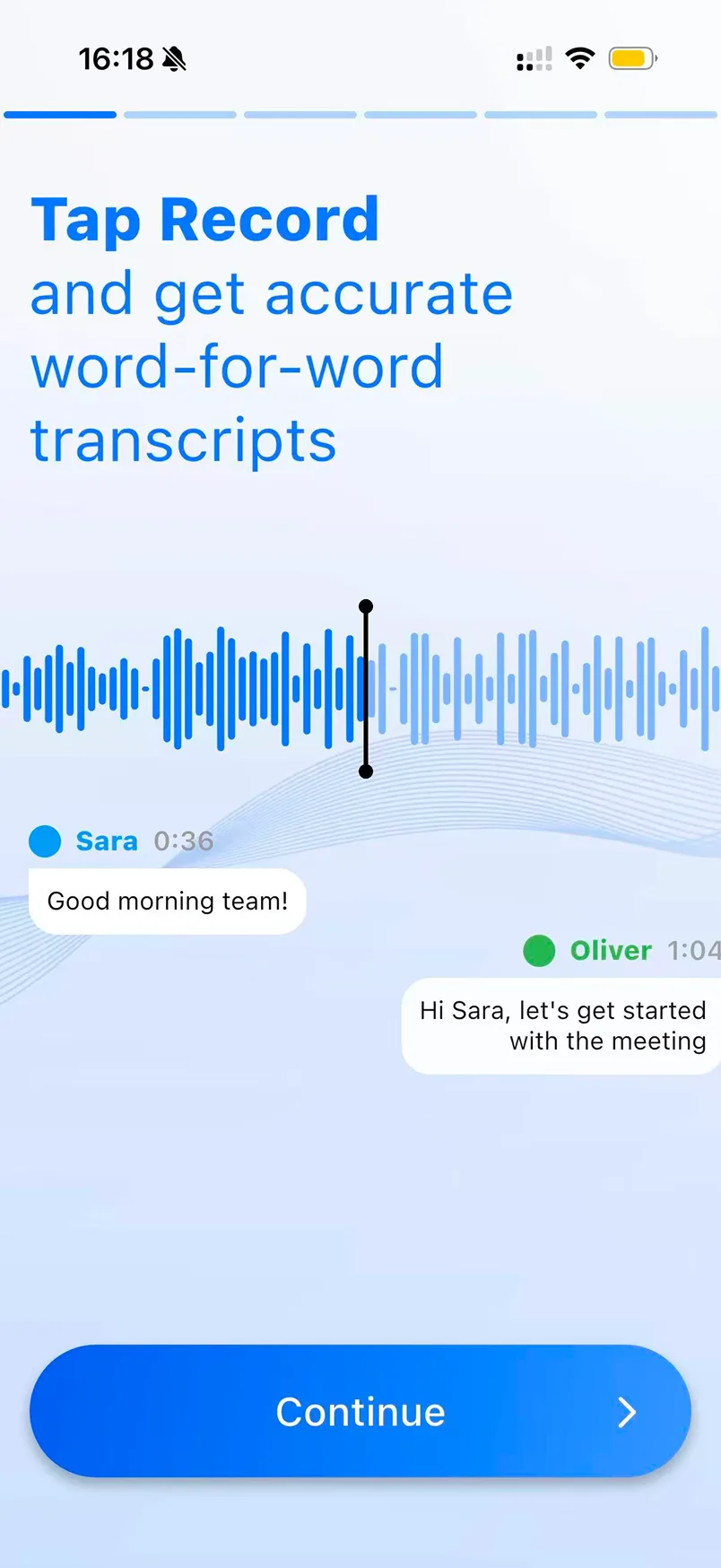
Open the app and the first screen tells you everything. A gradient pill button. A headline in brand blue on a pale blue gradient, bold for two words and light for the other seven, so the eye has nowhere to land. A decorative wave illustration behind the waveform, competing with the one element that carries meaning. Chat bubbles floating in space with no relation to the grid. A six segment progress bar that the copy never refers to. None of this is a matter of taste. It is a list of things the Human Interface Guidelines stopped recommending around iOS 7, in 2013, and the app is built for iOS 15 and up.
What I did
Strip it back to the iOS system, then make the one accent work hard
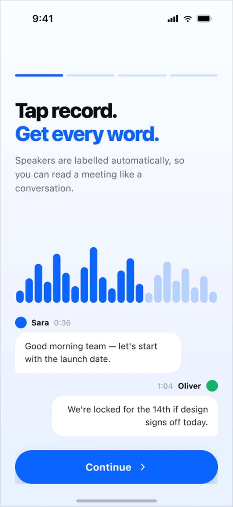
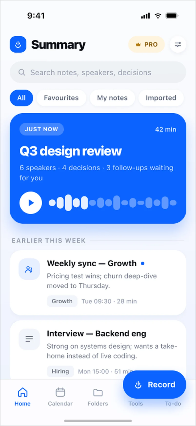
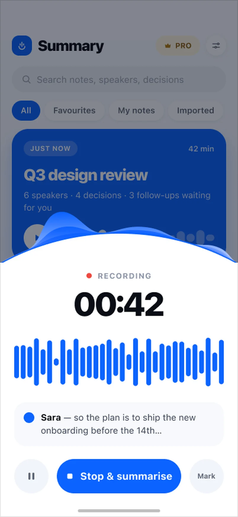
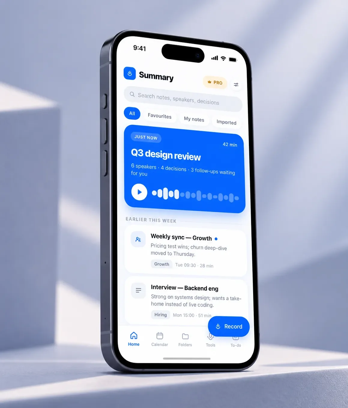
I rebuilt the visual language from the platform up. SF Pro at real system weights, one accent blue, one ink, neutral greys for everything secondary, and a single soft shadow used the same way on every card. Gradients and decorative art went. What replaced them is hierarchy: the current meeting is a solid accent card you cannot miss, older meetings are quiet white cards below it, and the record action is a floating button that is always in the same place. The onboarding says in six words what the original said in eleven, and the illustration under it is the actual product, a waveform and two labelled speakers, not a stock wave.
The strongest argument for the redesign is the pair of onboarding screens below. Same message, same feature, same brand colour. One of them looks like a product you would pay a hundred euros a year for.
What was wrong, specifically
Not old fashioned. Wrong. Each of these costs the user something.
- Blue on blue. The headline blue measures 3.9 to 1 against the background. That passes for a headline and fails the 4.5 to 1 minimum for anything smaller, and the same blue is reused for the speaker names and timestamps at body size.
- Gradient buttons and pill shadows. The primary button carries a two stop gradient and a drop shadow. Neither appears anywhere in the iOS system, so the button reads as a web banner rather than a control, and the eye cannot tell what else on the screen is tappable.
- Decoration over data. A grey wave illustration sits behind the audio waveform. The waveform is the feature. The illustration is noise laid over it.
- No grid. The two chat bubbles sit at arbitrary offsets. The speaker labels use a third blue and a green with no role anywhere else in the app.
- Nothing is system. Progress bar, buttons, bubbles and tabs are all custom drawings, so every new screen is a new set of decisions and the app drifts a little further from the platform with each release. The App Store notes for the last eight versions all read UI and UX improvements, and the screen still looks like this.
The system underneath the redesign
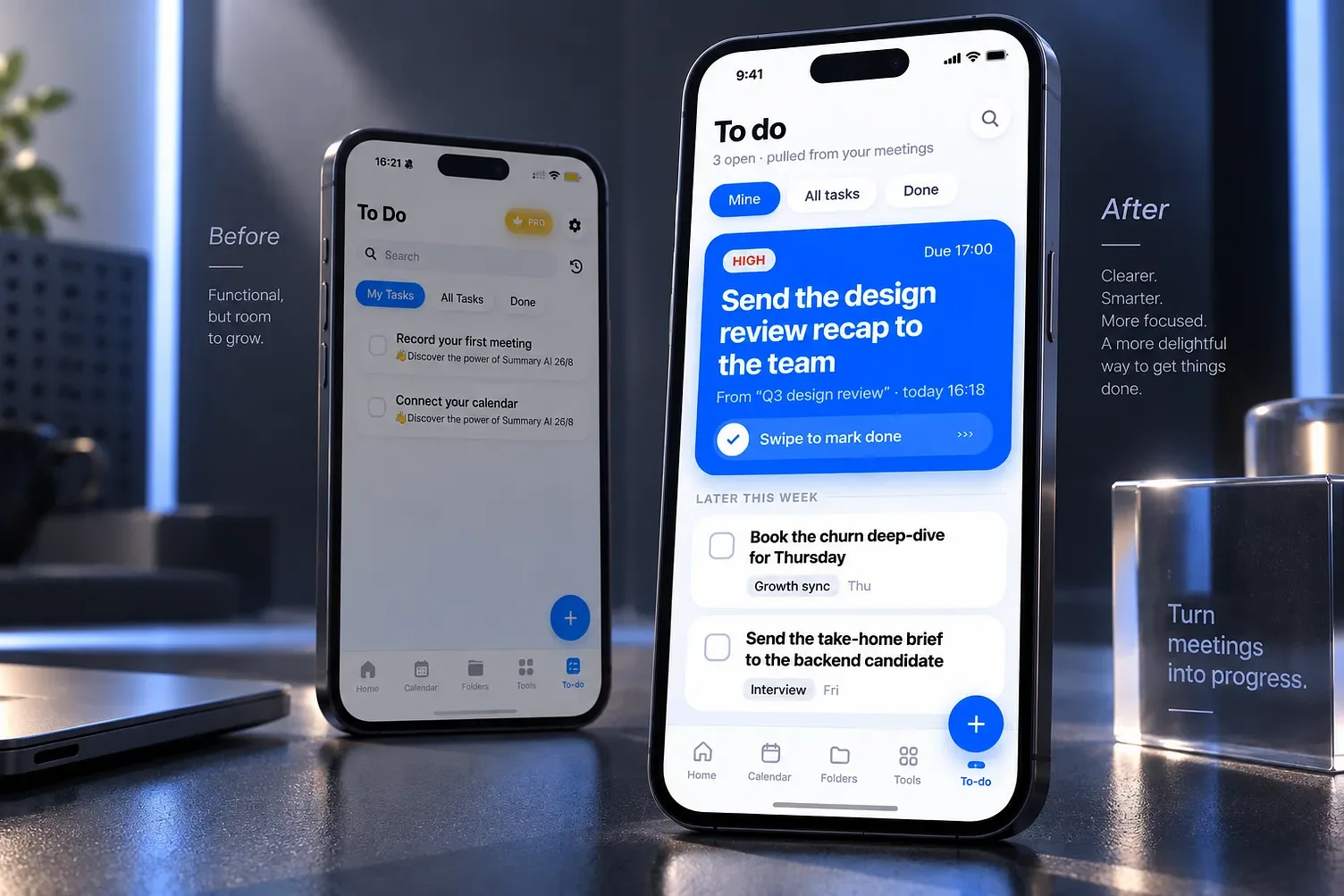
One accent, 0B63FF, and one ink. Text is ink or a grey derived from it, never a second brand colour. The accent is reserved for the current thing: the active tab, the latest meeting, the record button, the one decision that is due today.
One shadow, 2 pixels down and 12 pixels of blur at five percent, on white cards over a near white background. That is enough lift to separate a card from the page and not enough to look like a button from 2009.
Two radii. 28 pixels on cards, full pills on chips and buttons, 14 on small tiles. Nothing else. Once the radii are fixed the whole app starts to look like one object instead of a collection of screens by different hands.
Type does the hierarchy. SF Pro Heavy for the one line that matters on a screen, Semibold for titles, Regular for everything else. No colour is used to say important. Weight and size say it, the way they do in Mail, Notes and every other app on the phone.
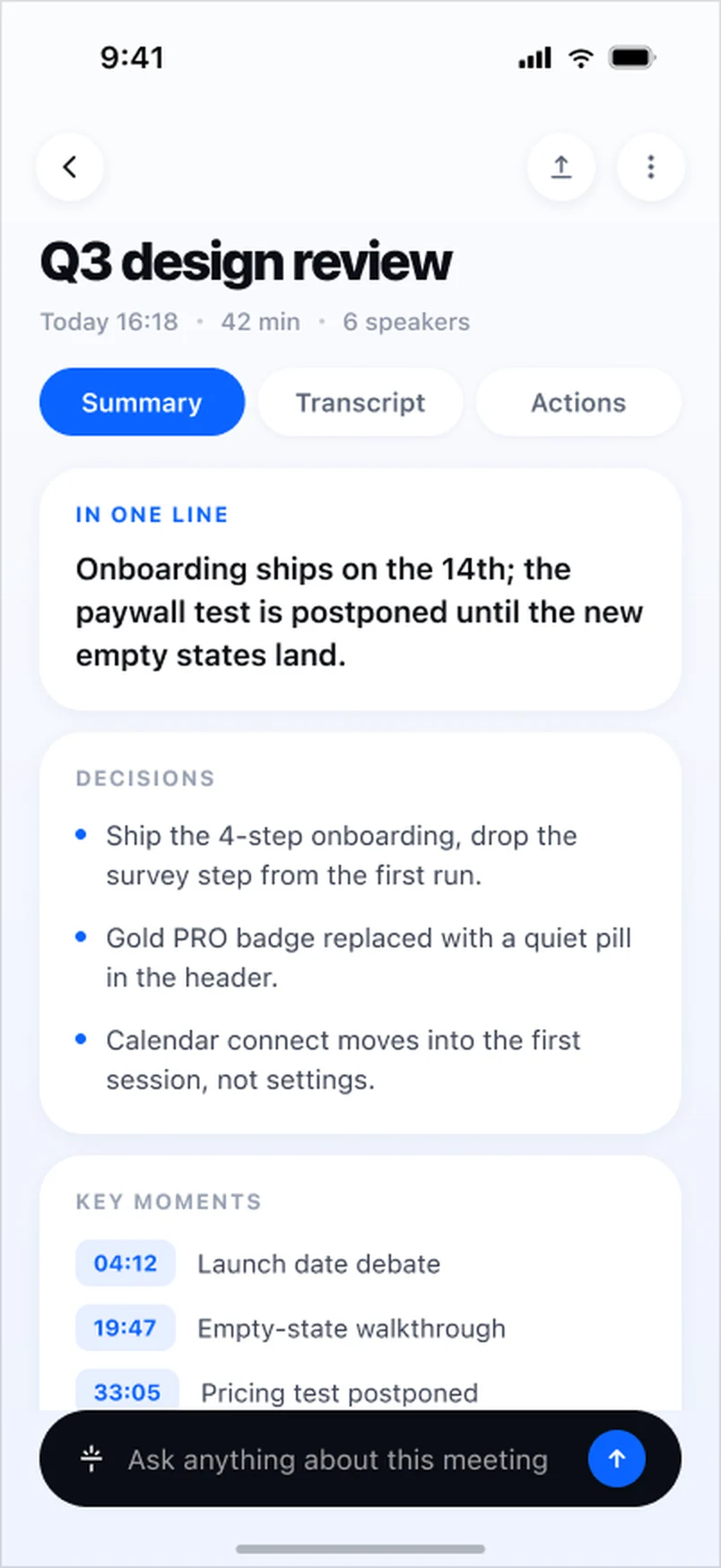
Every screen has a first thing. Home leads with the meeting that just ended, its speakers, decisions and follow ups. Summary detail leads with the meeting in one line, then decisions, then key moments with timestamps. To do leads with the one task that is due, pulled from the meeting it came from. The user should never have to scan.
Why the client should care
Summary AI charges 5.99 to 10.99 euros a week and up to 99.99 a year. At that price the interface is part of what is being sold. A screen that looks like a free utility from 2010 makes the paywall harder to justify, whatever the transcription quality underneath.
The redesign is not a reskin. It is a system that the team can extend without me: a token table, a component set, and thirteen screens that show how the rules play out in onboarding, recording, review and follow up. The point is that the next release should look like it came from the same people as this one.