Redesigning a live recovery app for people on their worst day
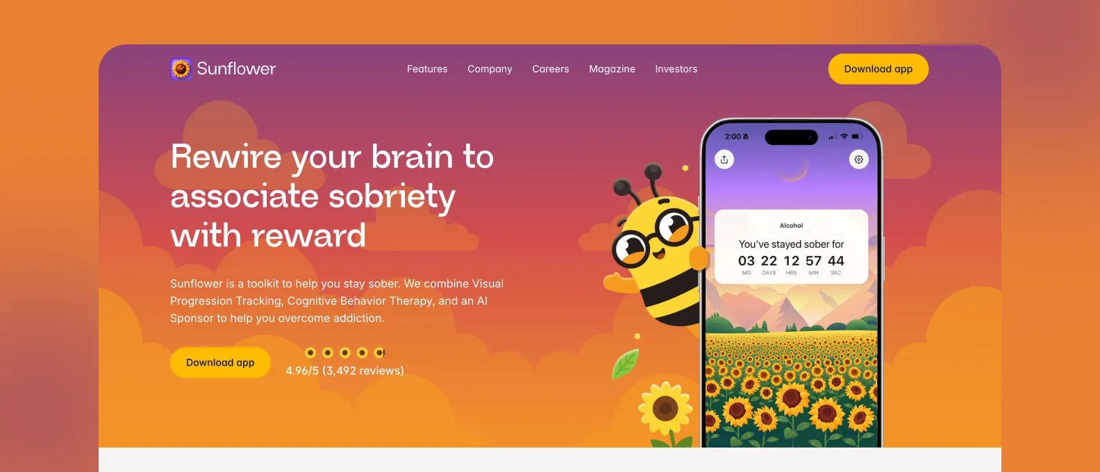
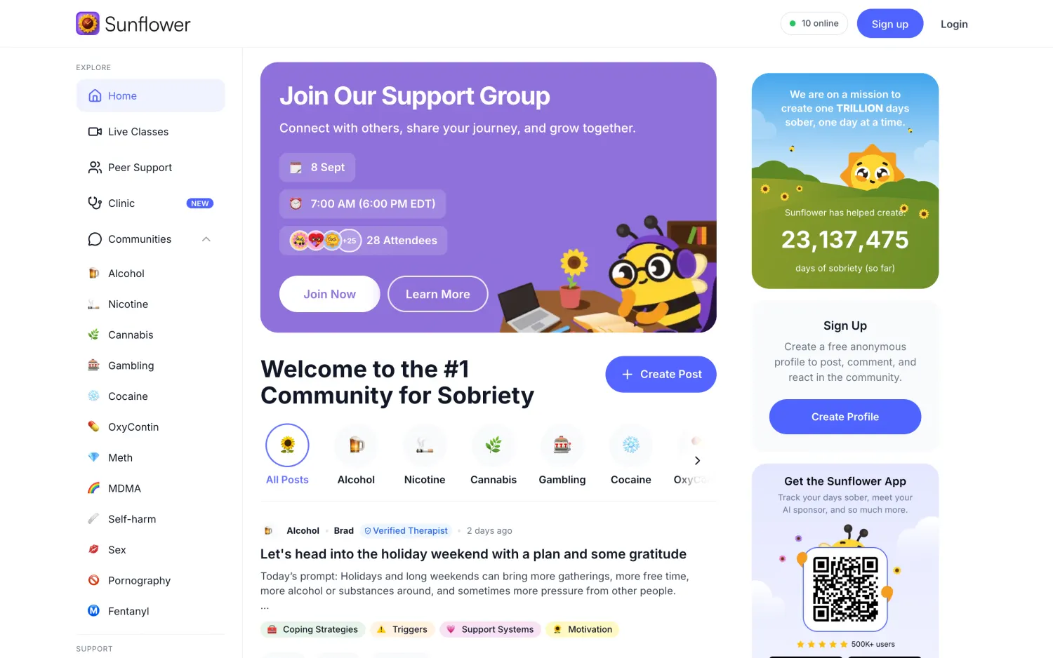
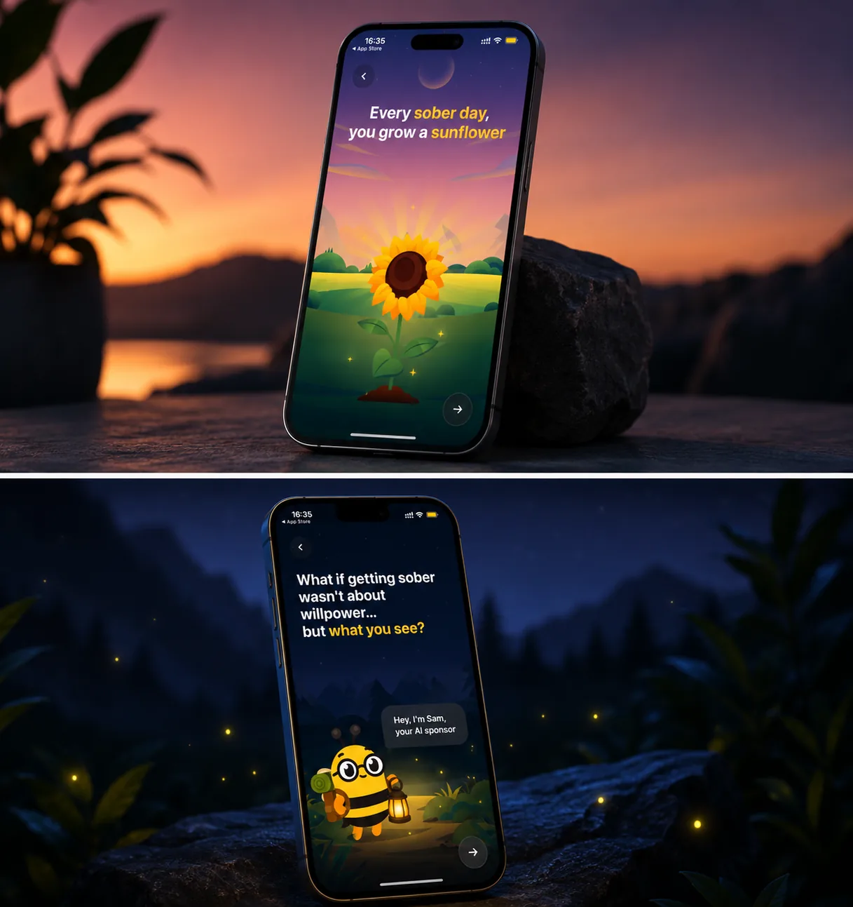
A sobriety recovery app with real users and an interface that got in their way. I designed the first version of the redesign: a new brand, a full design system and the core experience, in sixty days
- Role
- Product Design & Branding
- Timeline
- 60 days
- Scope
- Product design, Brand, Design system
The challenge
Designing for people on the worst day of their week.
Recovery products are used at the exact moment someone has the least patience for a bad interface. Every extra tap, every unclear label, every cheerful piece of copy that lands wrong is a reason to close the app and not come back. The bar for clarity is higher here than in almost any consumer category, and the cost of getting it wrong is not a churn statistic.
What I did
Strip the product to what someone can use when they are not at their best.
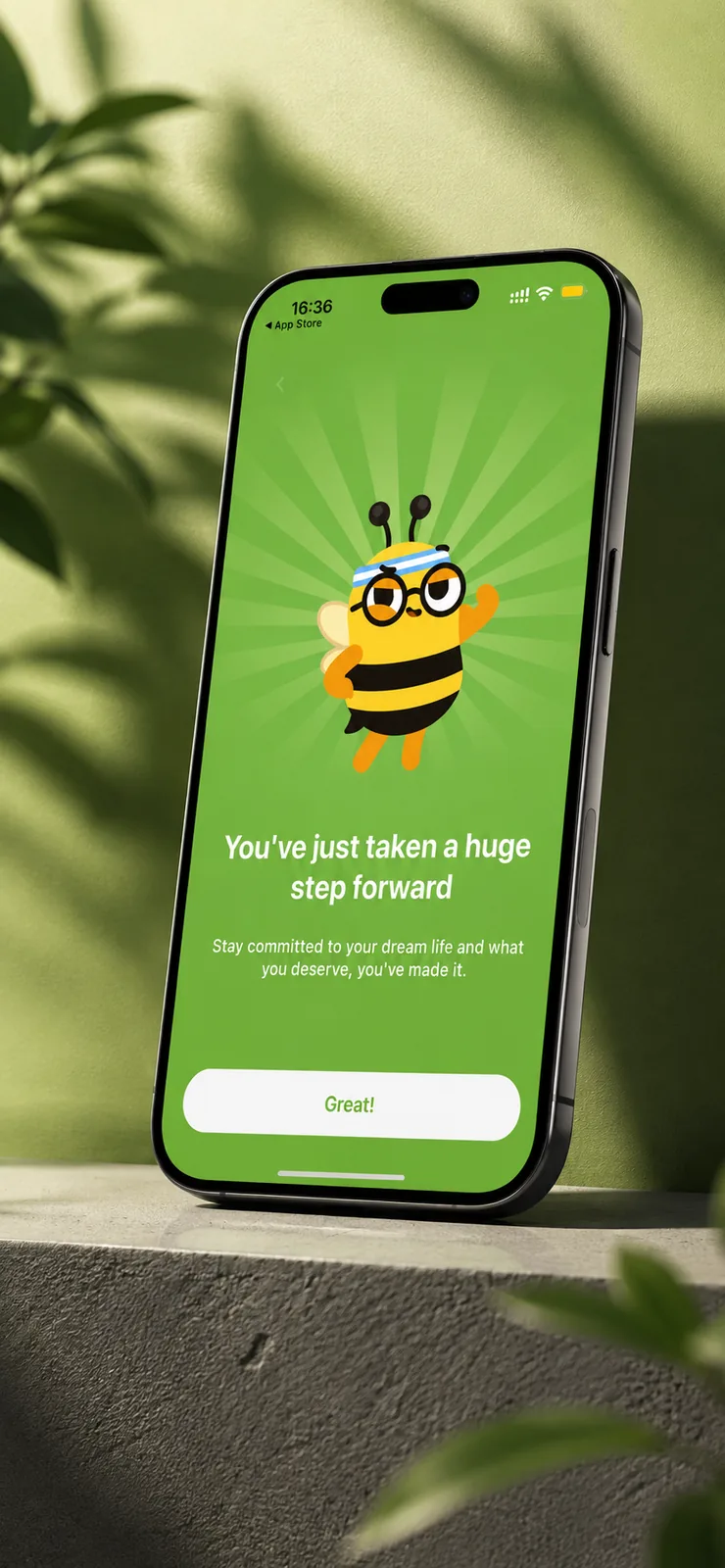
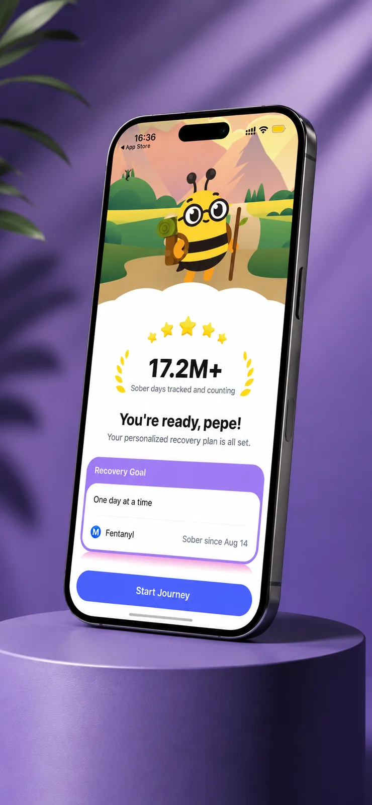
I designed the first version of the redesign: a new brand identity, a complete design system and the core experience, built around one rule: nothing should need patience. Onboarding was designed to be finishable in one sitting, which is where most health apps lose people. After the redesign, 68% of new users finished onboarding, up from 45%. Today the app holds a 4.8 on the App Store from about 6,400 ratings and has passed 500,000 downloads on Google Play. The app has kept evolving since.